For quite some time now, the theory of colors and how they affect our mood has been popularized and adapted by both professionals and amateurs alike. Not all rooms can have the same colors, as each serves a specific function. Just as an office is not meant for sleeping, a kitchen is not meant for showering, so they do not require the same lighting or decoration. Choosing a bedroom color palette to paint bedrooms is quite a science.
The bedroom is particularly special when it comes to decorating because it is a space whose main purpose is rest, relaxation, and disconnection. How can we achieve an environment suitable for an enviable floor plan but that also represents us? Easy! With interior design.
A suitable bedroom color palette for painting bedrooms can work wonders for our rest and daily life. Do you want to know the best color palette for painting bedrooms? Let’s take a little journey through the chromatic world to explain it.
Before painting, observe
We know that the moment of choosing the paint and its color is very exciting and one of the most desired things when renovating or redesigning a room. However, before getting to the more ‘creative’ part, it is first necessary to observe the room (in this case, the bedroom) that you want to transform. Is it very large or rather small? Does it have many windows or a lot of light? How many hours a day? Is this bedroom going to have a study or office area?
It is very important to answer these and other questions that may arise while observing the bedroom, its possibilities, and what you want to do with it. You may simply want to change the color of the walls or need a more profound ‘makeover.’ These questions will help you arrive at that answer and will be decisive in choosing the color palette to paint the bedroom.
Keep in mind that if, for example, yours is small, it will be more convenient to include lighter shades, which visually enlarge the space. You should also think about the functionality you want to give it (just a bedroom, add a dressing room, or a desk for work…) and the average time you could spend in this room (awake, of course). As mentioned before, colors can alter our mood, and we have to be very careful when choosing the ones that will accompany us in our sleep.
Don’t worry, because throughout this article, we will guide you step by step through all the colors you should use (and avoid). If you need extra help, you can always count on us. Before starting with the colors, we’ll reveal a secret to choosing the best palette for you: once you have some colors chosen, paint small samples (20×40 cm.) on each of the walls in the room. This way, you can compare them, see the effect each one has on the room, or observe in real-time which one you like best. You’ll observe them in different light (at various times of the day) and see how the colors change. One last piece of advice: keep in mind that the color on an entire painted wall will always appear more intense than in just a sample.
Color palette for painting bedrooms
And now, without further ado, we present to you the perfect color palette guide for painting bedrooms:
White
We’ve mentioned it before, but a white palette is ideal if the bedroom is small, as it enlarges the space and brightens it, so if you also don’t have much natural light, it’s perfect. Additionally, this palette is composed of unsaturated colors, so they calm and relax when it comes to sleeping. Moreover, they do not interfere at all with the decoration or materials you want to add, as it will always look good, as in this interior design project ‘New York dwelling.’

Beige
Following the white palette is beige, an intermediate color that brings a bit more warmth and harmony without losing all the advantages of a neutral color. It is perfect if you are looking for a more classic or rustic style. Look at what they have done in the bedroom of this terraced house.
Light Grey
Although it may be an unpopular choice, this type of greyish color palette helps to sleep well thanks to its calm and not so ‘loud’ tone. You can combine it with more pinkish tones and light woods. Without a doubt, it is one of the top colors for a completely relaxing room, as is the case with this neoclassical apartment.

Soft Yellow
In our collective imagination, yellow is usually classified as a striking color, hence we add the distinction of ‘soft.’ This palette of tones has many well-treated and combined possibilities to achieve a luminous and warm bedroom. It is perfectly combinable with other tones from the same palette (beige, white, grey, blue…).
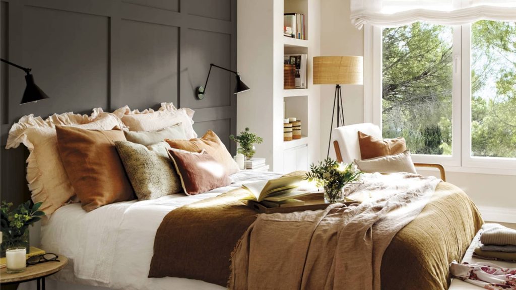
Earth Tones
Earth tones are one of the most demanded palettes this year and are definitely on-trend. Seeking an approach to nature and the outdoors, colors like brown, green, terracotta, or caramel provide serenity, calmness, and naturalism.

Light Blue
If you have a very hectic or stressful lifestyle, this shade might be the best for you. It has been shown that blue is related to longer sleep hours. Our brains associate this color with the sky and the sea, which causes a wave of relaxation and calm, reducing heart rate. You can combine it with white bedding to enhance the effect.

Pink
This color is not usually on the table when choosing a color palette for painting bedrooms, but if you choose a specific tone and a matte finish, it can completely transform the space. According to color psychology, a pastel tone or with low saturation calms and relaxes.

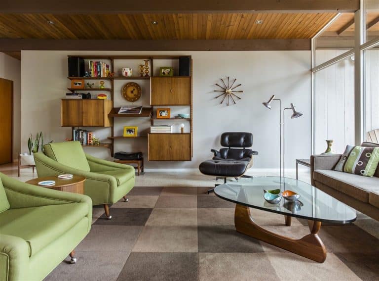
Light Green
This tone is perfect because it has the same explanation as earth tones: it reminds us of nature and its vitality. Light green specifically is very refreshing and cheerful, so it looks great in restful spaces. If you find this color too much, you can paint the walls in a more relaxed tone and add small touches of this color in the decoration or bedding.

Dark Green
If we were talking about how light green can be too much for someone looking for a calm bedroom, dark green is the perfect alternative. You don’t give up on this cheerful and vital color, but you achieve a much more relaxed effect. It is perfect for combining with softer tones, such as pink and sand.

Black
It is not the most chosen color in a bedroom because of its darkness. We recommend that if you finally opt for these tones, make sure the space receives enough light. It can look very elegant, mixed with textiles like gingham.
Greyish Blue
This tone follows the same rule as black: it can only be put on the walls if the room has a guaranteed natural light source since it is darker and can look opaque. It is ideal if you want to give your bedroom a rustic yet modern touch at the same time. It doesn’t need much decoration because this color captures the attention and becomes the protagonist on its own.

‘Verdigris’
If green and grey are perfect color palettes to put in a bedroom, together they can work wonders. The former brings vitality and the latter relaxation. They balance each other out and both bring necessary attributes in just the right measure. If you add some white touches, you can get much more light.
What color palette to avoid?
Now that you have an idea of which color palettes are most suitable for painting bedrooms, it is advisable to know which tones we should always avoid whenever possible. To know this, you must consider the main objective of a bedroom: sleeping. All the colors we put in this room should help fulfill this mission. In addition to temperature, light, and mattress quality, the colors we choose can make us rest better or worse. Those chosen will be linked, therefore, to better rest.
To do this, we must always avoid bright or very flashy colors, such as red, orange, yellow, or very vivid pink. All these palettes have a very high vibrational frequency that revitalizes us and can be useful for other rooms where we need to be awake or active. However, in a bedroom, we need to reduce the feeling of fatigue and feel safe.
Colors with a lot of saturation excite our brains and force them to ‘be alert.’ That’s why it is recommended to avoid them as much as possible, especially when choosing wall colors. Certain touches in decoration are permissible, but the best thing you can do is experiment and try for yourself to see if they bother you or not.
Within these colors, bright tones are also a ‘no’ in a bedroom, as they amplify emotions and prevent us from disconnecting from our thoughts. As they reflect light, they interrupt our body’s natural sleep cycles and keep us awake when, in reality, what we need is sleep.
With bright tones, you have to follow the same line as with saturated ones: if you really like them, in small doses of decoration and never as protagonists. You can play with the light to balance those tones with the rest of the room.
With these tips, you’re sure to choose a color palette to paint your bedroom that fits its shape and your personality and taste. If you need a little more advice and, by the way, want to reform the room a bit and remove a column or remodel it, you can count on Manuel Torres Design.
In our studio, we help you carry out your project, anticipating your needs and offering you the best result. If you have any questions or need advice, you can contact us. We provide personalized proposals to give your home’s interior a new twist.
The images used in this post do not belong to Manuel Torres Design, unless otherwise indicated. Credits for these images belong to other companies, photographers, and professionals. We appreciate their contribution in inspiring our content and recognise their work.