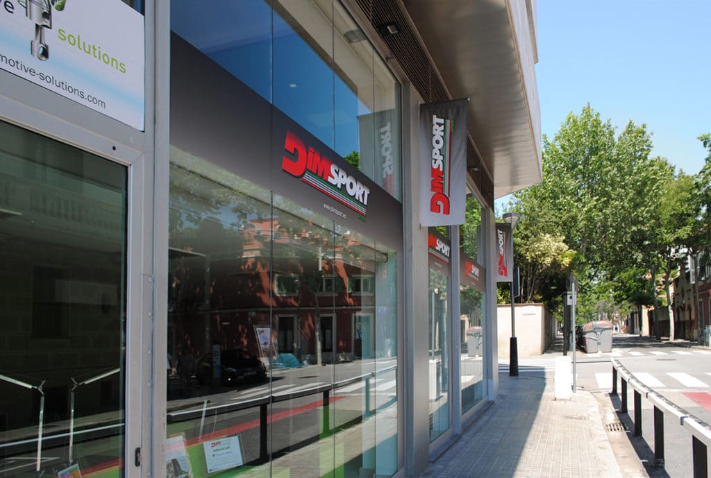
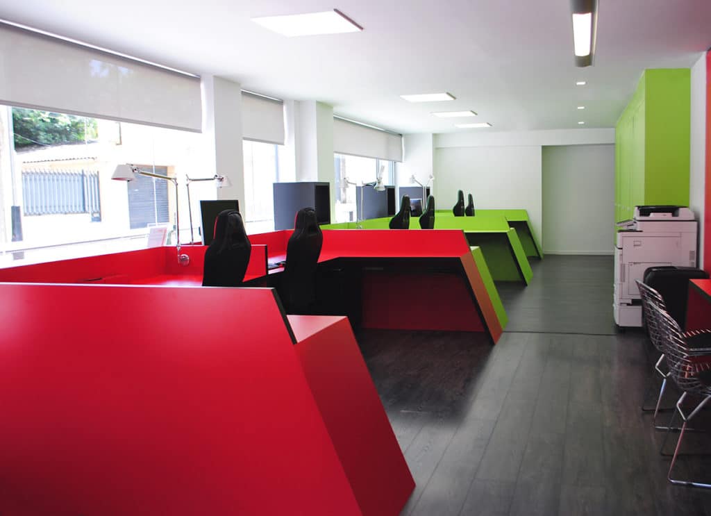
MANUEL TORRES DESIGN, of GRUPO COMPLEMENTA, has carried out the project of expansion of the corporate offices of the company DIMSPORT -International Group of Italian origin HOLDIM SRL- in Barcelona, in the neighborhood of Sarrià. It has created an atmosphere with colors and shapes according to the brand identity of the company that give the space personality while creating a coherent and quiet environment where you can work comfortably in all rooms.
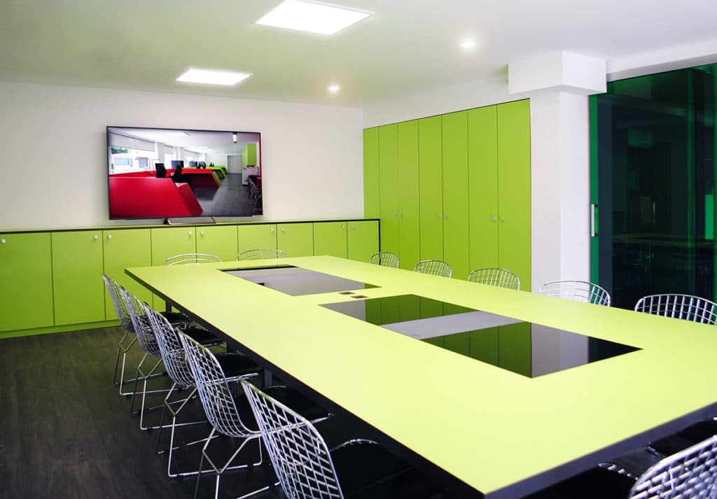
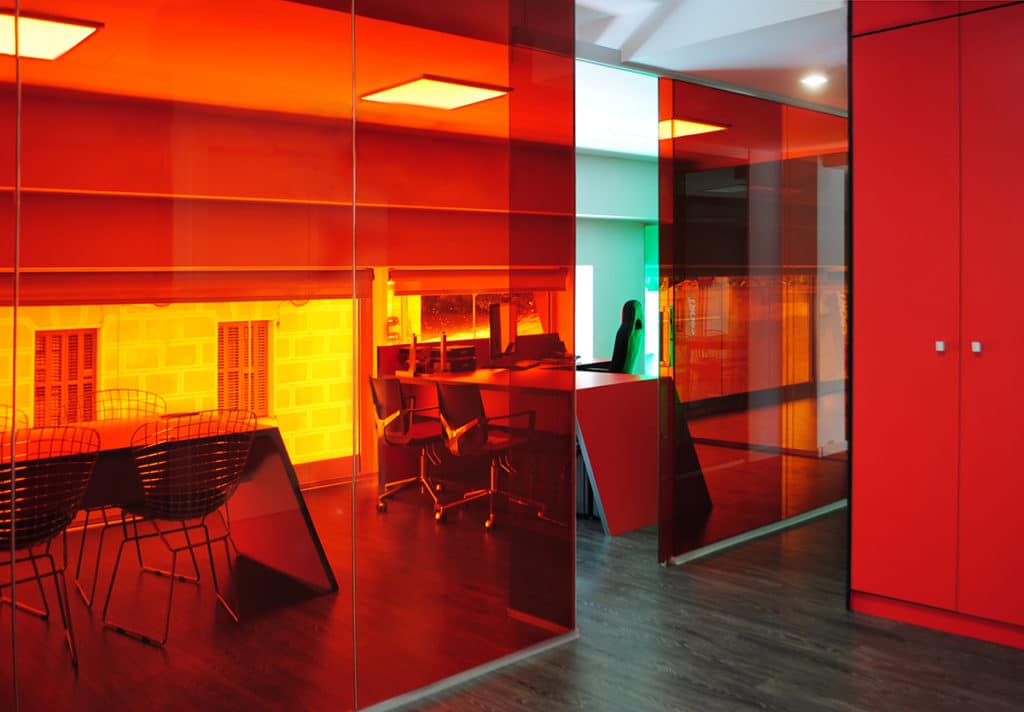
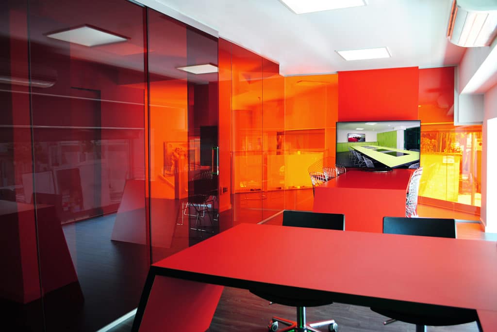
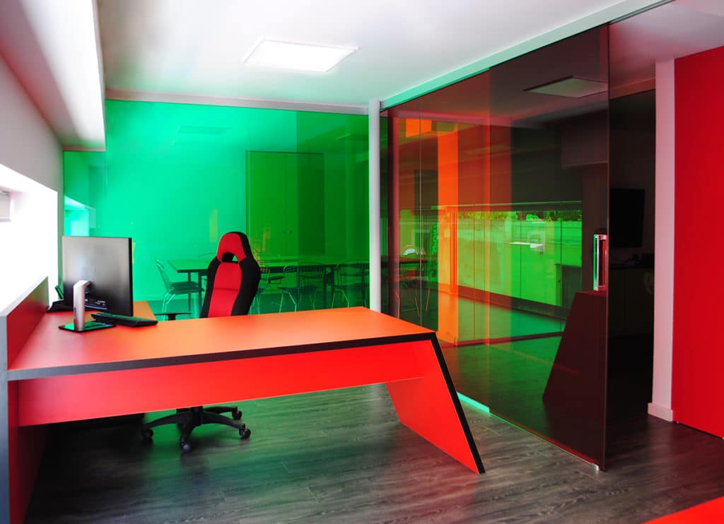
The concept seeks to generate visual amplitude using partition walls of translucent glass from floor to ceiling of different colors, which separate the spaces to preserve privacy and control noise, but at the same time transmit the feeling of an open, bright place providing lightness. It has been given meaning by completely equipping each of the areas efficiently, in order to create a work space in line with innovations and latest trends in the office design sector, such as the design of spaces Open Space, creating more open and spacious spaces, the Natural lighting, making the most of its potential, or the Cromoterapia, using neutral colors contrasted with elements that add color to the space.
The space, 240 m2, is divided into 2 levels that separate the different functional areas. On the ground floor there is the reception desk, the operative working areas, the archive and the services. On the upper floor there are the waiting room, the management office, two meeting rooms, toilets, the office and a technical area.
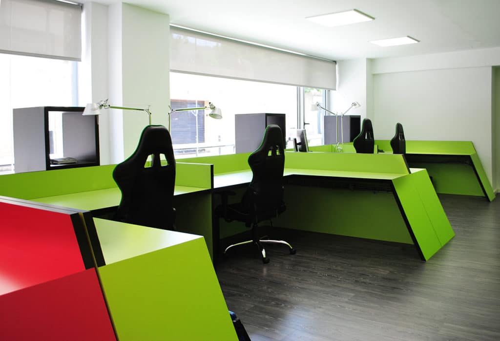
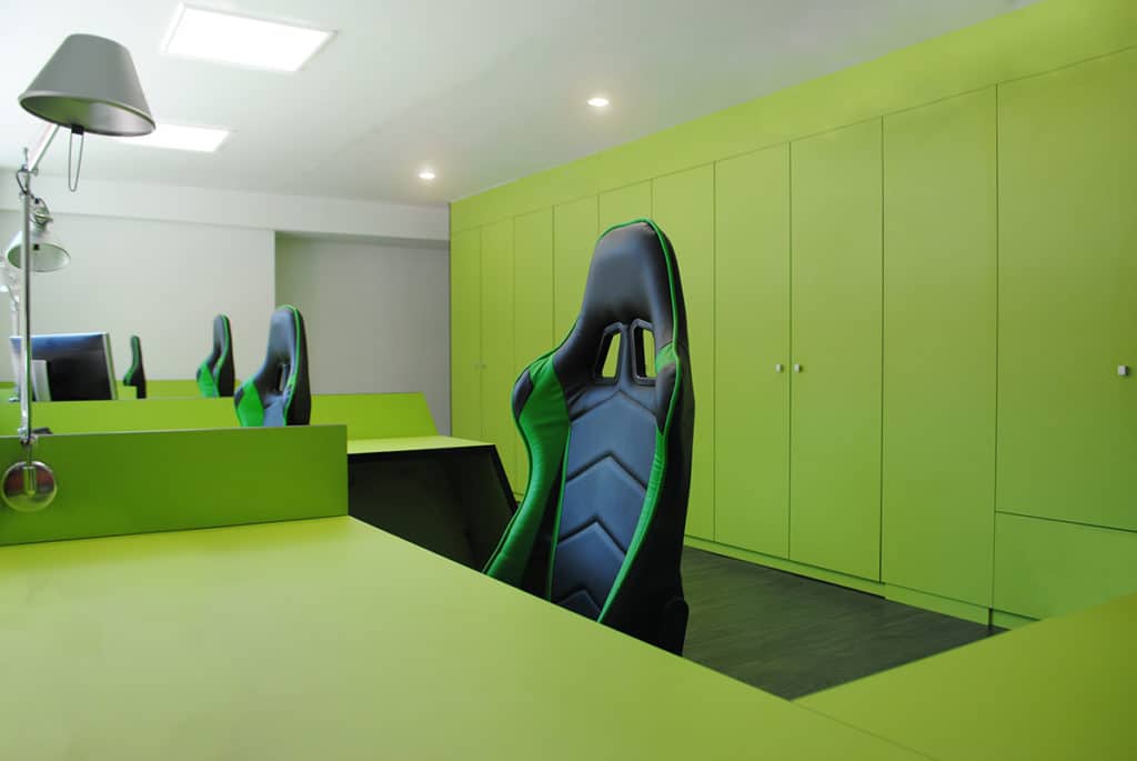
The furniture of inclined lines has been designed to measure for the space, taking the concept of speed and dynamism to represent the essence of the company DIMSPORT. The chromatic palette of said furniture unites the two corporate concepts. On the one hand, red, used in the graphic identity in the logo, represents the automotive world, passion, speed and strength; On the other hand, red is complemented by green, the color of the ecology, of the environment, which refers to the other line of business of the company with ECOMOTIVE SOLUTIONS. Following the line of the ecology, the materials of the furniture are sustainable and respect the values of the brand and respect the coherence of the space.
To compensate for the chromatic expressivity of the furniture and dividing walls, a dark wood-like flooring has been used for the entire space to create a uniformity on both levels.
The objective of the Study has been to create a space in which the brand identity of the company is reflected, representing its values through materials, furniture and in general in the design of the spaces. The space in this way represents innovation, technology and ecology and meets the functional objectives, optimizing the space for its functional and practical use, reaching the maximum comfort of the people who will inhabit it.
