Renovation of the Eurofred Group corporate offices under the green-open space concept, signature design and new technologies.
The project for the Eurofred Offices headquarters was created from the commission by the company to renovate its workspace. The proposal was based on reinterpreting the traditional concept of an office building, combining spaces for the well-being of the user in a sustainable and innovative structure.
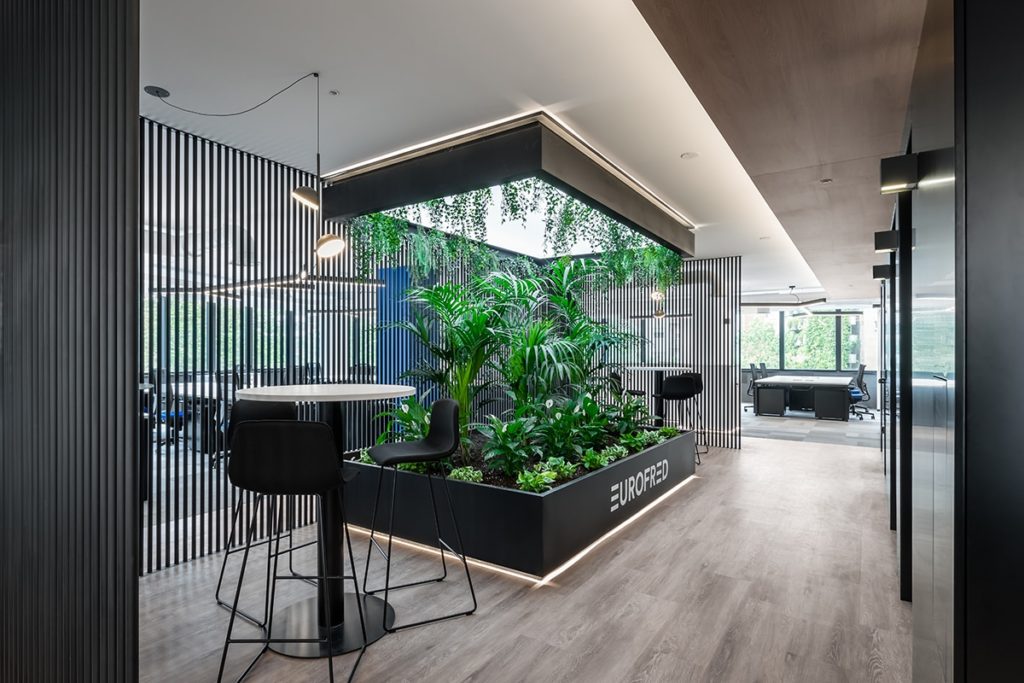
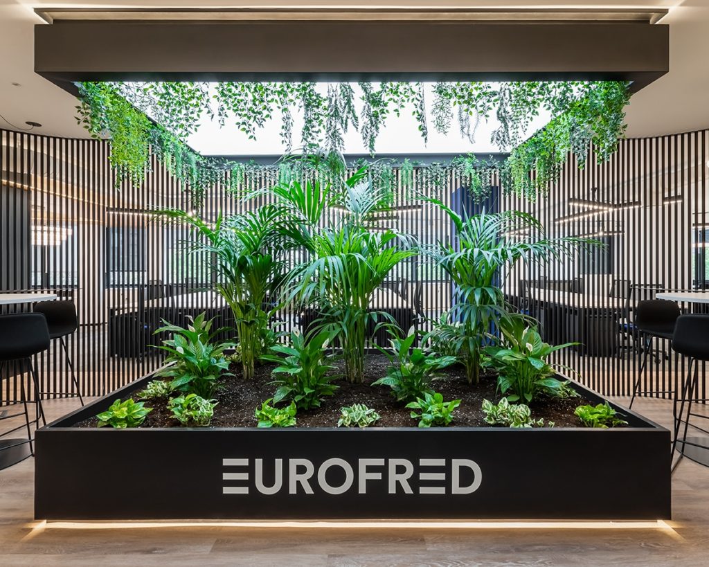
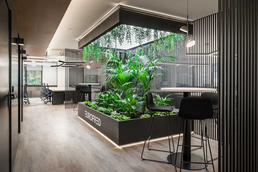
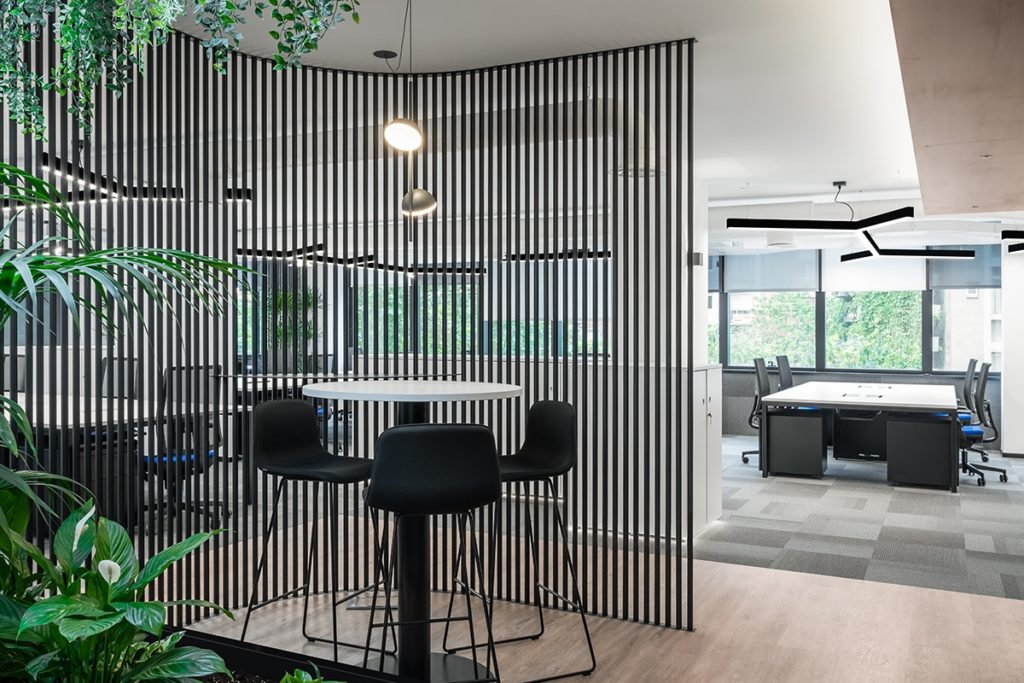
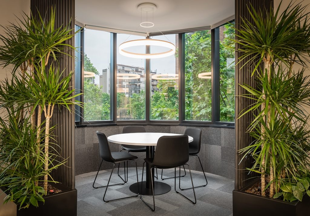
One of the main axes of the design was the construction of a green space within an open space as a resource to unite people and work teams with nature, without leaving behind the formal language of the project, which is to maintain the identity of the brand, having as a common denominator between these two lines of design technology, ecology and sustainability.
“With this project we wanted to ensure that all workers can access the most mundane technological and digital resources, as well as establish a family relationship between the workspace, workers and nature in response to the changes that we had to assume as designers to what throughout the pandemic ”.
AUTHOR DESIGN IN A FLEXIBLE, SUSTAINABLE AND ARCHITECTURAL SPACE
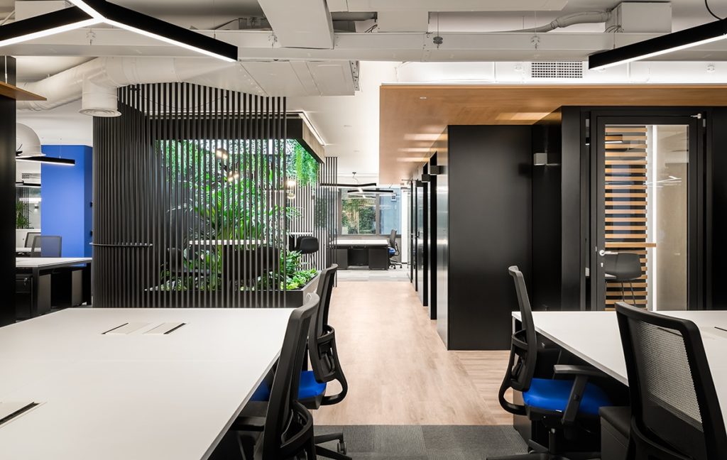
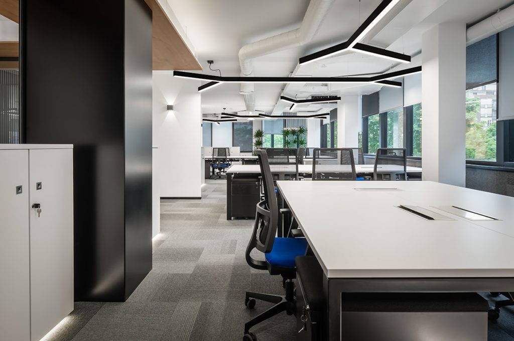
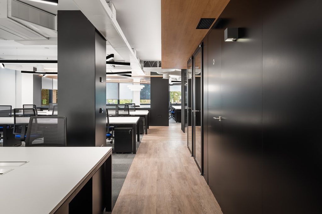
The development of the project consists of the renovation of the four floors of the Eurofred corporate building. The spaces were designed in a way that allows flexibility in them, responding to the different needs of the workers, providing a collaborative work environment where hierarchies do not prevail and the user is in constant contact with nature.
Each floor of the building has approximately 400 m2 and an average of 55 jobs.
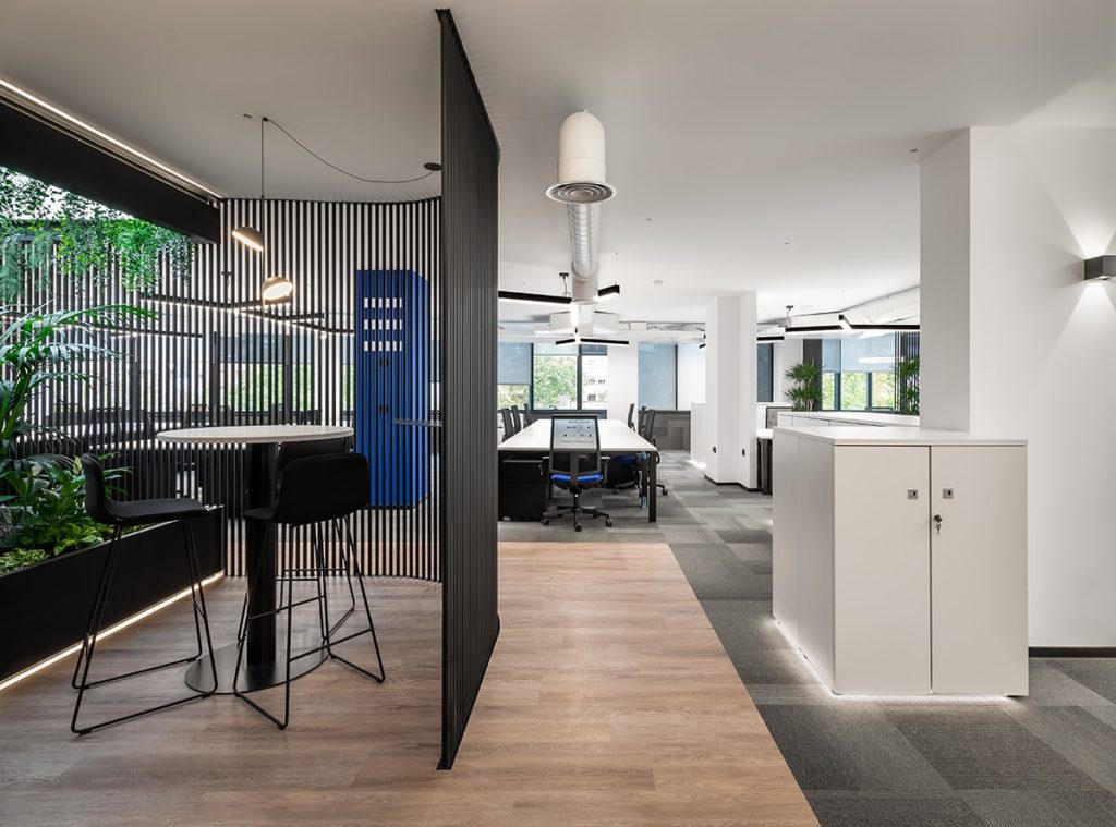
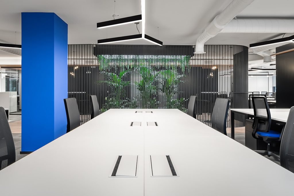
Upon entering the plant we come across a green hall built of iron, which contains a planter of natural plants. The decision to incorporate biophilic design within the offices was due to the numerous advantages it brings, such as improving air quality, increasing creativity and its consequent health benefits for those who work there. The hall also contains two co-participating areas, which allow the intersection of users creating a family atmosphere within the workspace.
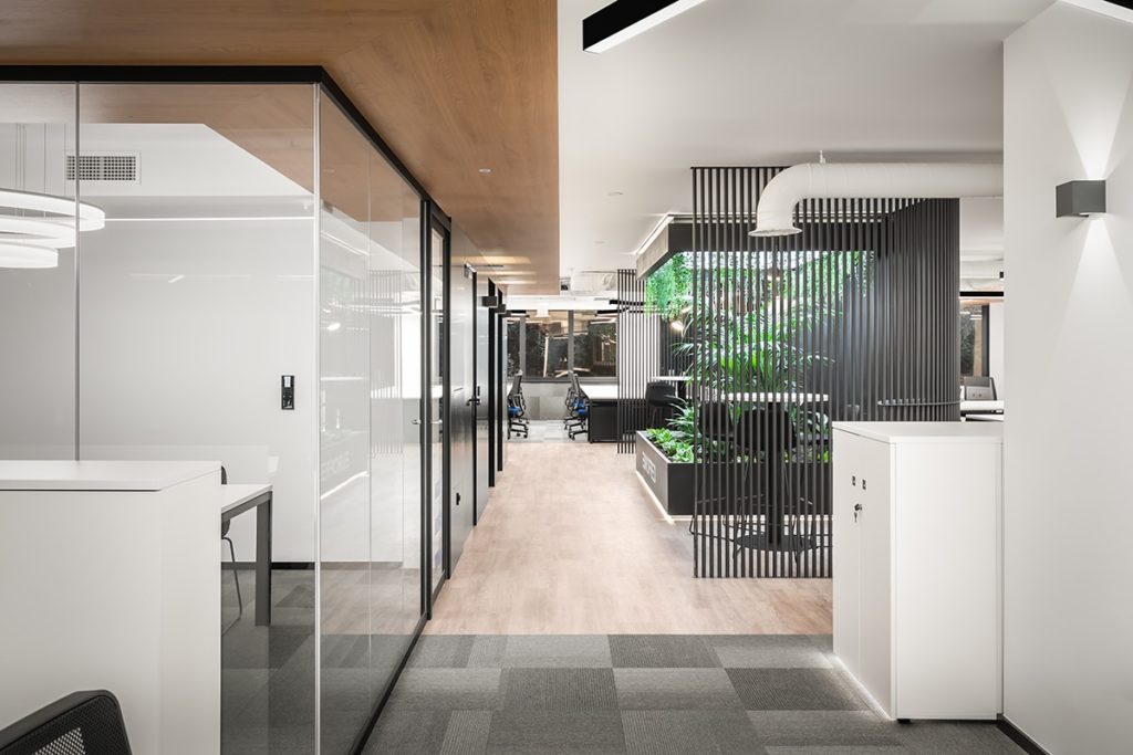
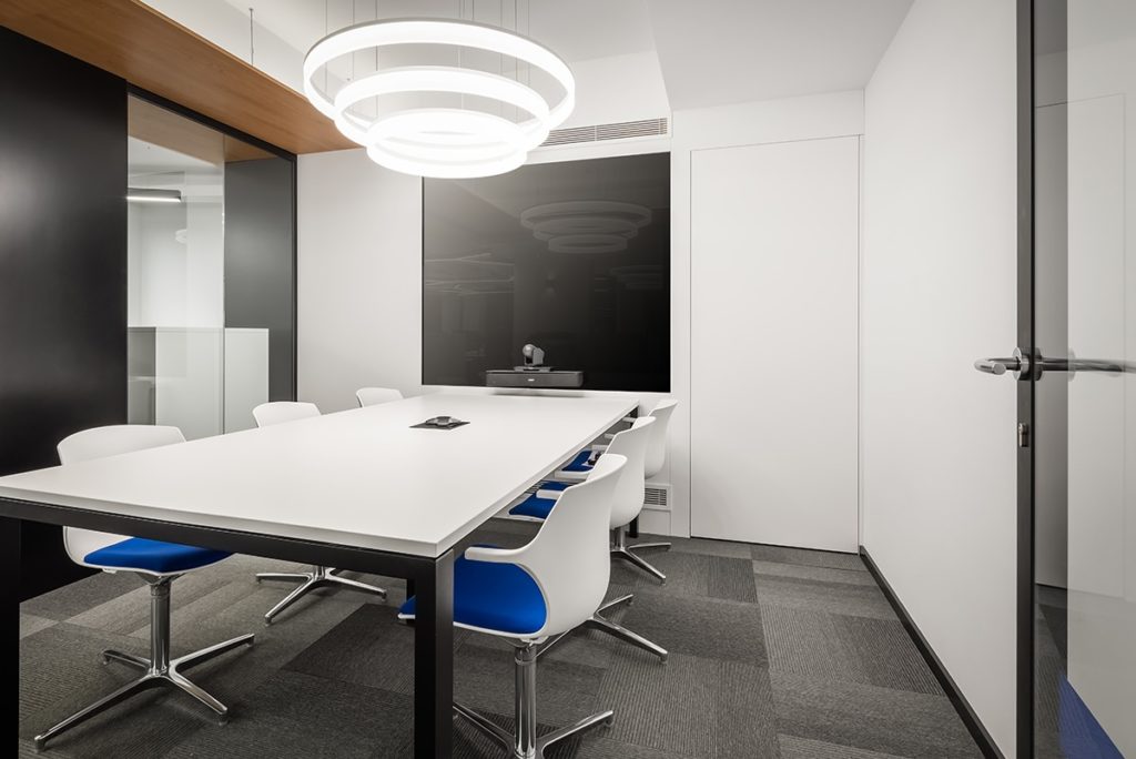
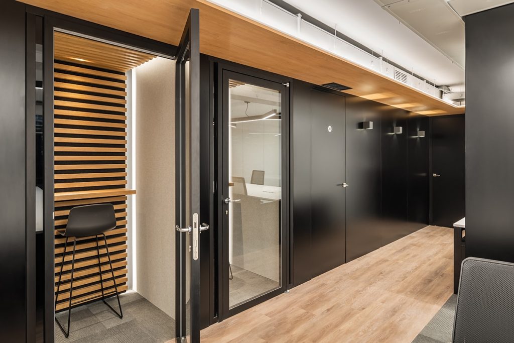
As they are open-plan floors, two totally soundproof Silence Rooms were proposed in each of them, to be able to isolate themselves when talking on the phone and not interrupt the rest of the colleagues. These phone booths next to the Quick Meeting are the only private rooms in the work area. The Quick Meeting room contains a Magic Mirror system for conferences, exhibitions etc, hides a TV behind black glass, being completely flush with the wall. It also has a Crestón system to reserve the room and thus achieve the incorporation of design and technology as a merger between the MTD studio and the Eurofred Group company.
All the people who work there have access to the same equipment, which was designed from an ergonomic point of view and there is only one office open for the manager.
These many design decisions that have been made throughout the project arise in response to our main concept of home office.
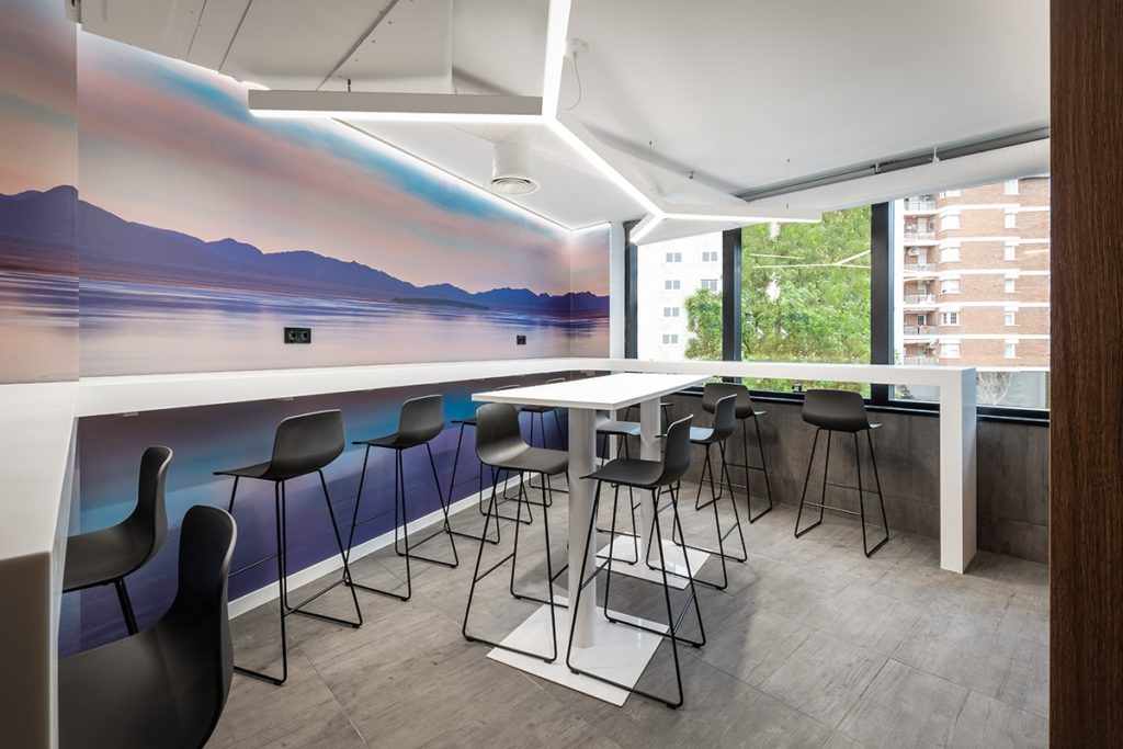
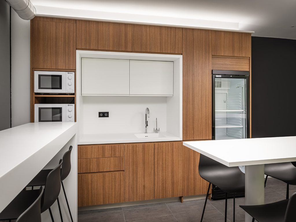
As a space for rest and disconnection, a fully equipped office for leisure was proposed, and its main characteristic is that of the walls which contain billboards with images of nature, consciously selected so that the user can relax during their rest time.
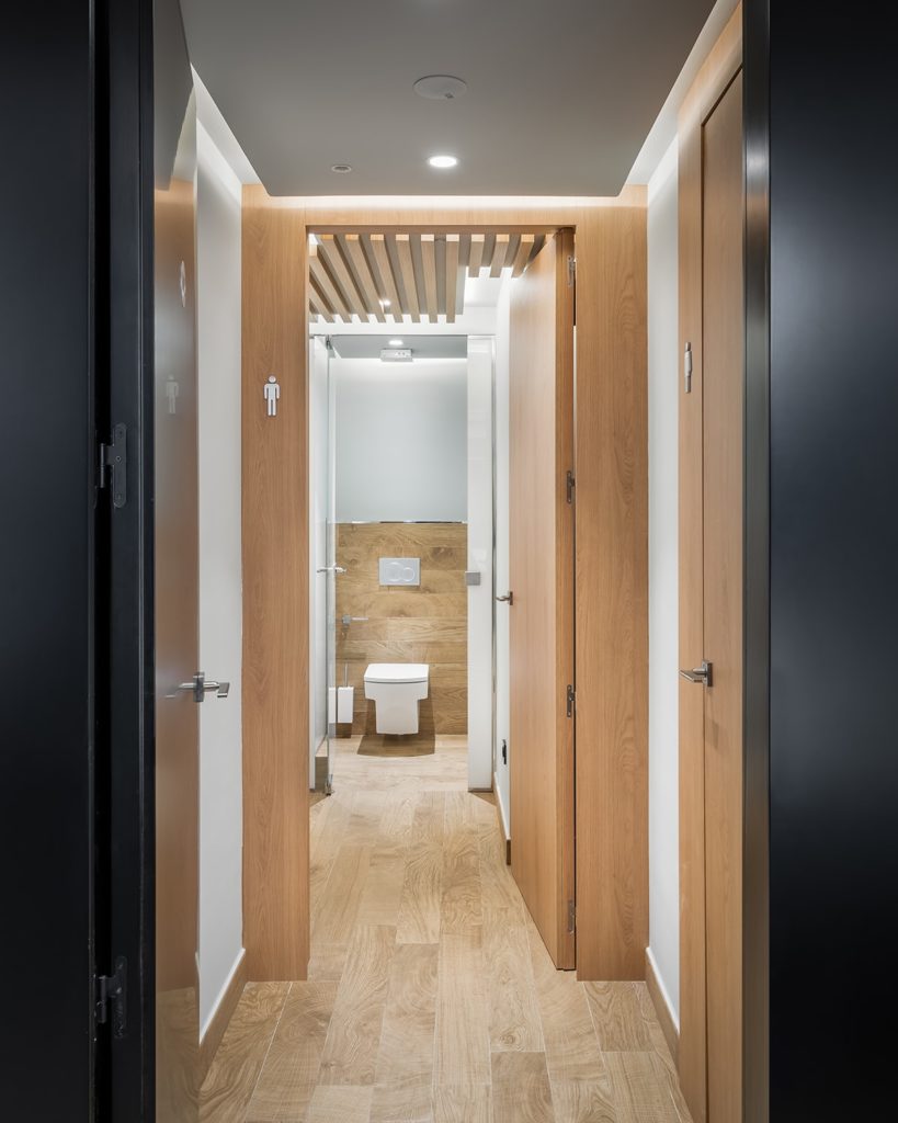
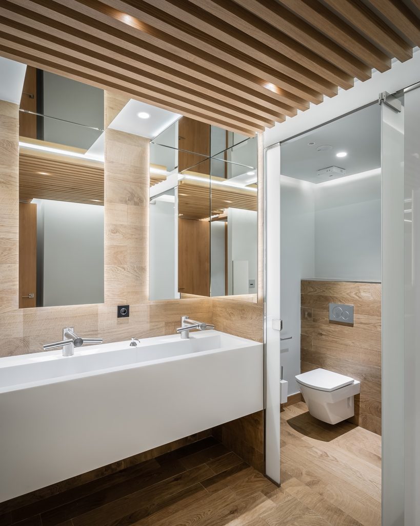
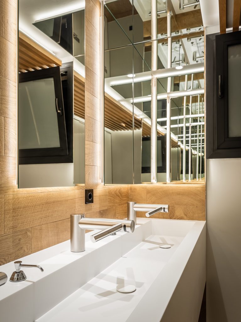
The toilets were designed with an integral design of all its elements. Each floor has a bathroom for women, men and people with reduced mobility. Taps and Airblade hand drying technology have been implemented, thus generating a cleaner bathroom, reducing the use of paper and having an ecological design as a principle.
SUSTAINABLE ARCHITECTURE: CORPORATE MATERIALITY AND COLORS
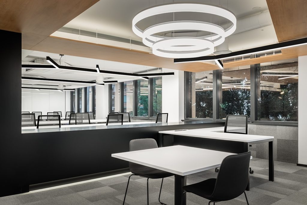
In terms of materials, environmentally friendly elements have been chosen, such as the use of wood in ceilings, silence rooms and toilets to increase acoustic absorption. The use of textiles, paints, pavements among other materials that, due to their qualities, have achieved ecological seals.
The balance of color was also taken into account. White was chosen mainly since this color is key to creating calm environments, so it is vital in the workspace to improve concentration, blue, which in addition to being the Eurofred Group corporate color contributes to productivity and imagination, making the brain as active as possible and green as a symbol of nature that reflects technology at the service of ecology.
DESIGN AT THE FOREFRONT OF INNOVATION: HOME AUTOMATION AND NEW TECHNOLOGIES
In the project, the natural light and ventilation inputs have been maximized. All this has been designed so that it can be regulated through home automation technology. Either in curtains or in the ventilation system and thus generate energy savings, reducing the building’s carbon footprint, benefiting both the user and the environment.
The entire building has a consumption control system, supported by a super efficient heating and cooling system.
Artificial lighting was selected and designed especially for this project. It is controlled in three ways: by means of a presence sensor, by regulating a button that each operating station has on its table, which allows the intensity of the light to be adjusted, and by a mobile application.
In addition, each floor has C02 control that improves the quality of indoor air that workers breathe and brings a notable and indisputable benefit to users.
Likewise, there is an irrigation control for the green areas and a control of audiovisual equipment.
All of this was designed and carried out to maintain the energy efficiency values of the Eurofred brand and the Manuel Torres Design studio.
