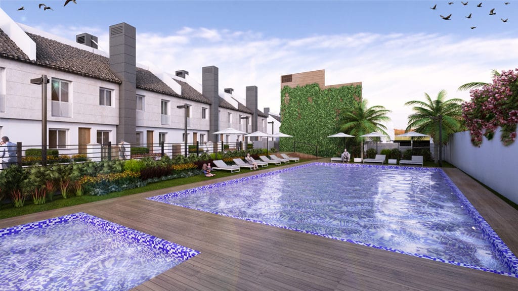
Manuel Torres Design, from the Complementa Group, has designed the architecture, interior design and equipment of the commercial office building of the high-standing residential complex BIOSFERA TOWERS. Located in the city of Querétaro, specifically in the luxurious municipality of Jurica (Mexico), the studio itself was already in charge of the comprehensive realization of the interior design and architectural redistribution project of the entire residential complex.
The Biosfera Towers Commercial Office is projected on a total area of 1,000m2, which includes the construction of the same building, parking areas and direct access from the main road that connects Querétaro with Mexico City. The architecture of the building follows the same values under which BIOSFERA TOWERS is built, these being the innovation, exclusivity, quality and comfort of the spaces.
In this way we find two typologies of Sample Departments of housing development. One on the ground floor that has a total area of 150m2, divided into: a dining room and a living room, to relax and watch television with the family; a master Suite with its own bathroom and dressing room; two double bedrooms; two bathrooms (one of them free); kitchen and service area with bedroom; bathroom and laundry area. On the upper level we find another 95m2 Sample Apartment divided into: dining room; a master suite with its own bathroom and dressing room; a double bedroom; a courtesy Toilet; kitchen room; laundry area and terrace.
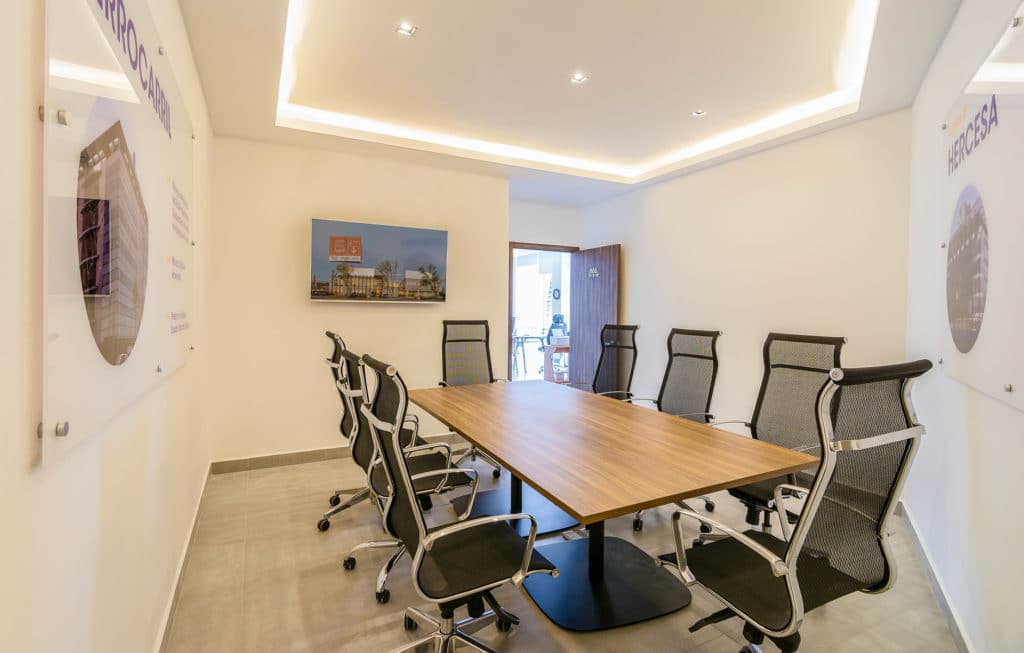
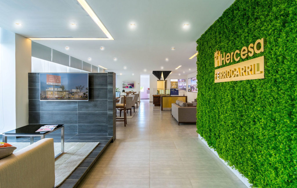
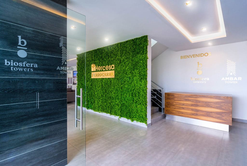
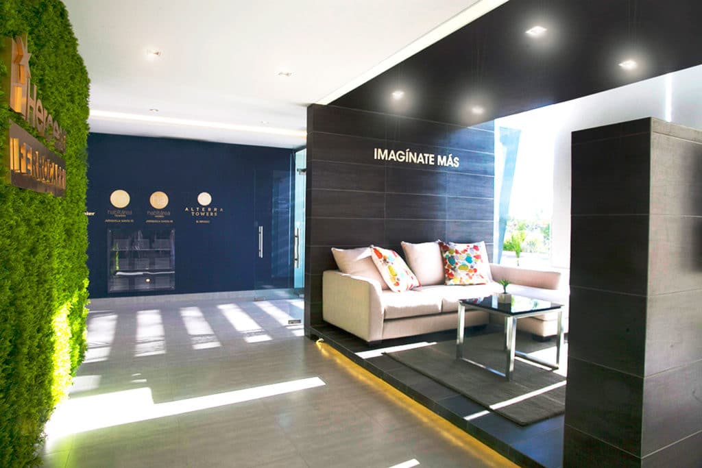
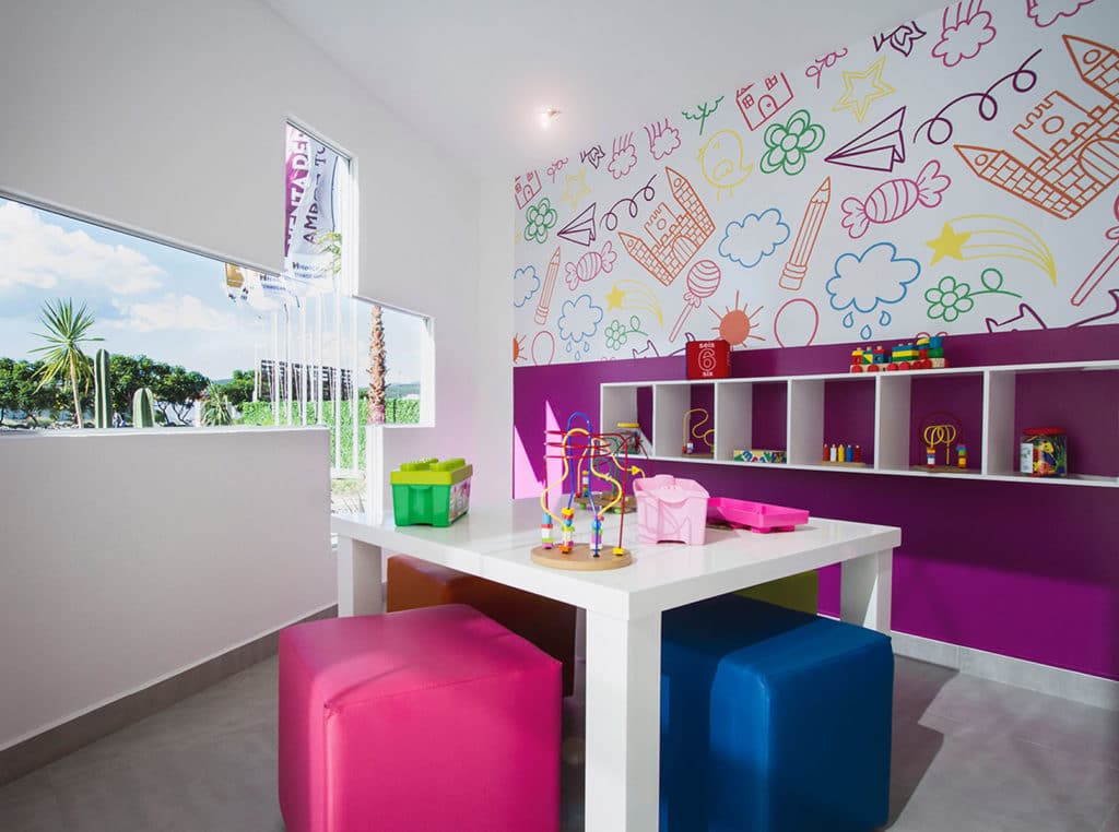
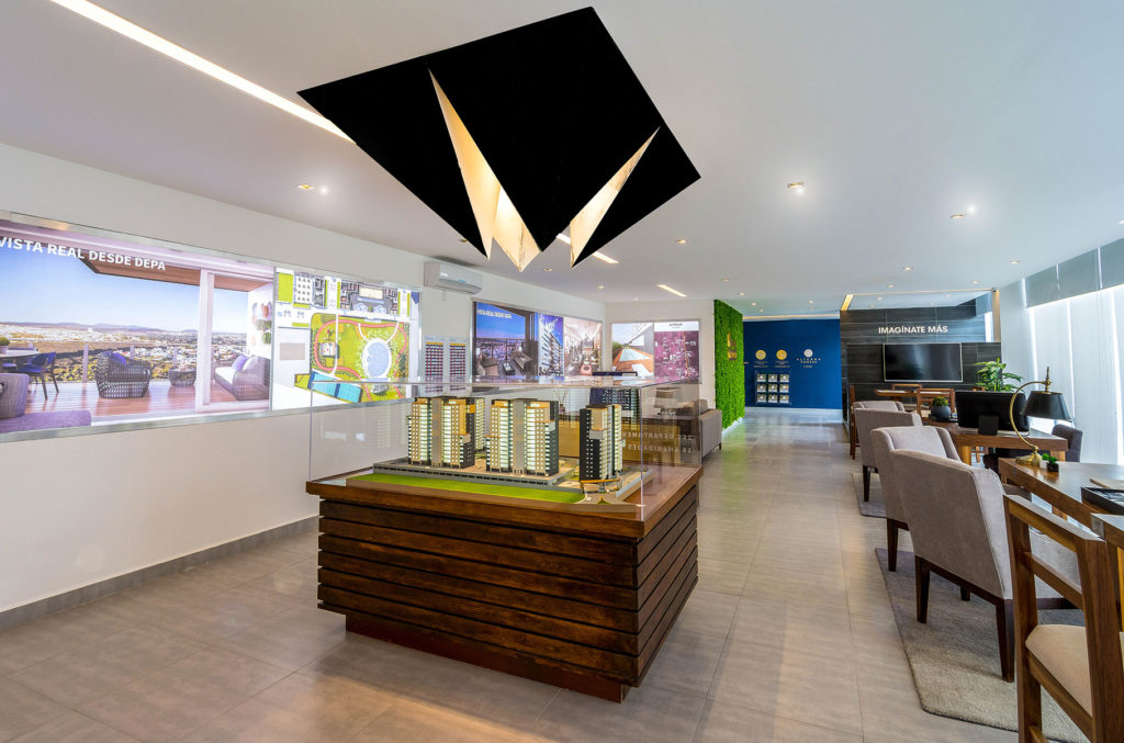
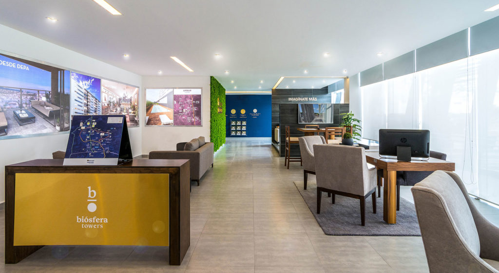
The Commercial and Sales Office occupies an area of more than 400m2 on two floors. The ground floor is distributed in: a Waiting Room; a Sales Area; Games and Coffee Zone; two bathrooms and Cellar. The Waiting Room is dominated by a structure that rises from the ceiling and opens to us with an overhead light presenting the scale model area. At the next level we find that most of the surface is occupied by the Work Area, through an open space concept; then we have a waiting room; an office; three meeting rooms, two bathrooms, separated by gender, and a kitchen with a wine cellar and access to a terrace. All in shades of gray and black with wood accents given by the work surfaces.
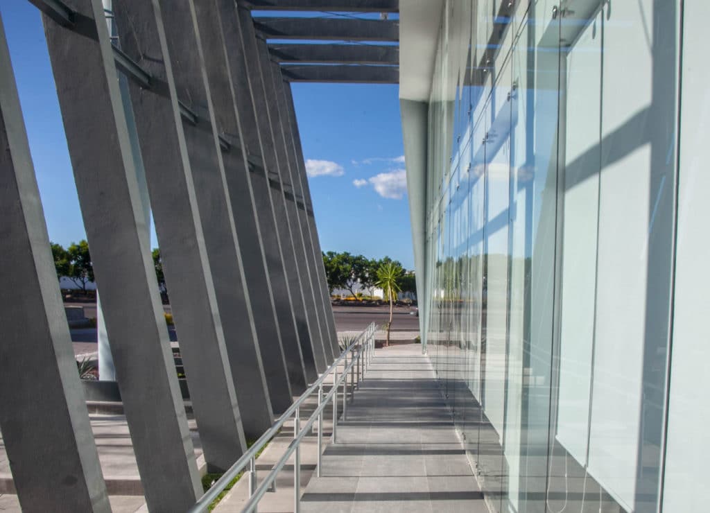
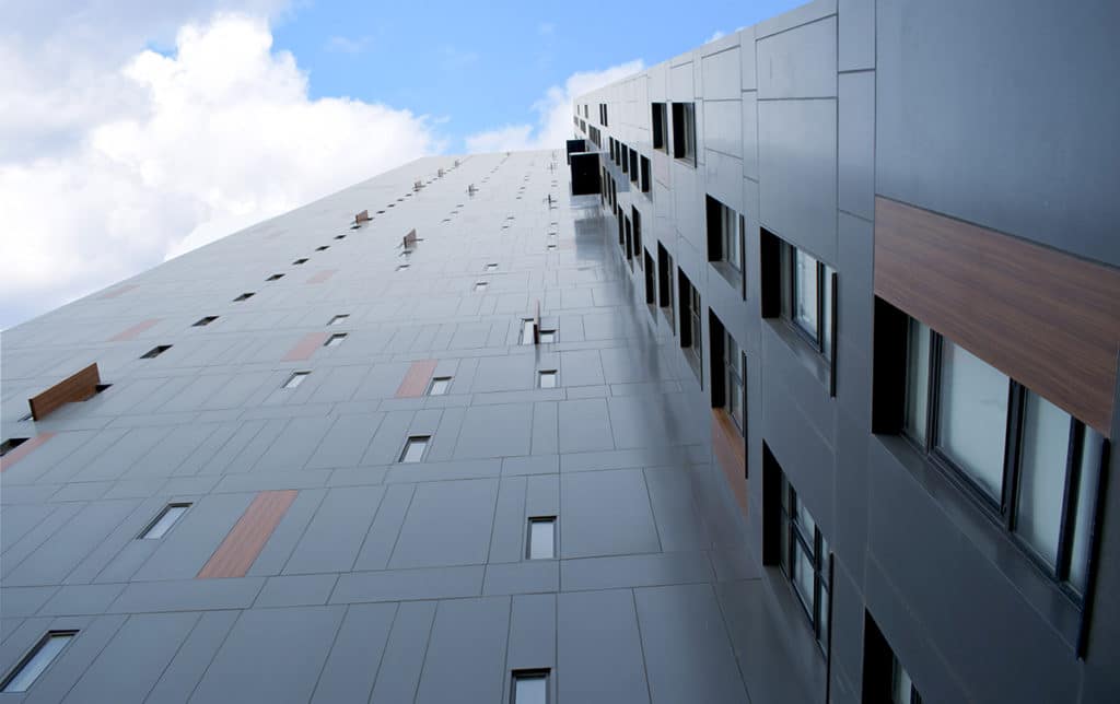
The Building that contains these two spaces is surrounded by a rib that protects while providing privacy. Externally, the two spaces of this container are differentiated by a chromatic change in the glass that makes us differentiate the Sales Area from the Sample Department.
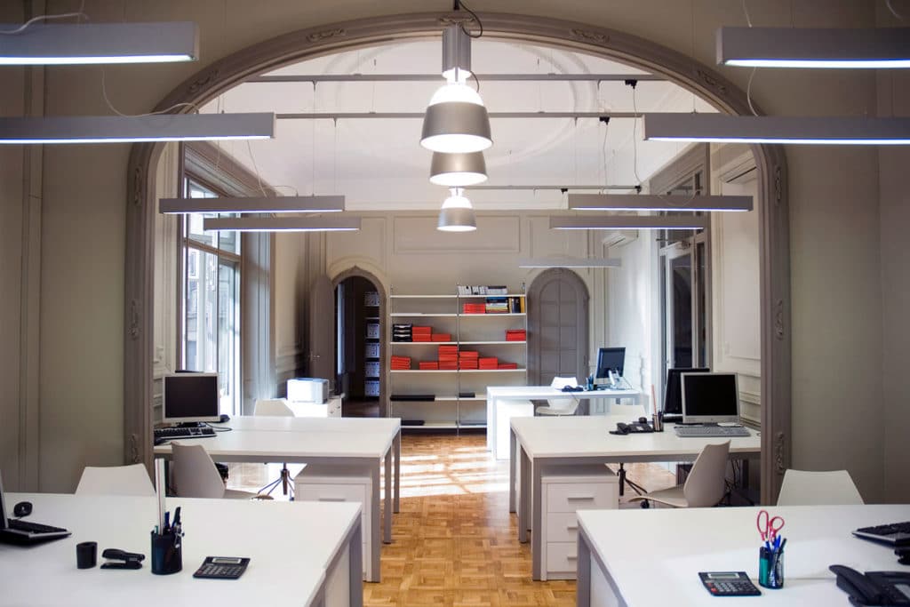
The purpose of the Commercial Office project is to optimize spaces and achieve an avant-garde and innovative workspace through a design of suspended work tables, increasing the feeling of spaciousness within the area, creating modules for workers that are arranged longitudinally in space and sectioning the open work area of the offices. A false ceiling with a rectangular proportion is used which, through pits and built-in linear lighting, generates uniformity in the space.
