As is tradition, at the beginning of the year, we must catch up on everything that 2024 will bring us in terms of decoration and interior design. Designers and professionals in the industry have already started, and at Manuel Torres Design, we don’t want to fall behind. So, we have already compiled one of the fundamental pillars of decoration: colour trends of 2024.
A simple but accurate touch of color can completely change the appearance and vibes of a room, especially if done tastefully and considering all the elements we already have in it. If, in addition to seeking advice from a studio, we choose the trending colors of the year, we will have our home ready for the rest of the year and will be the envy of any visitor. Do you want to give your spaces a twist without sacrificing style? Let’s see those colour trends for 2024 (and some that will be left out).
The importance of color
It is proven that the colors around us or the ones we wear on our clothes or accessories influence our mood, wherever we are. Therefore, we must be careful when choosing the colors that will be part of our home. An error in the selection sometimes makes us not entirely comfortable in that space.
Everything will depend on its function. Let’s think, for example, of a bedroom, whose mission is to help us disconnect, relax, and finally, have a quality sleep. If we decorate the walls with bright and vital colors that encourage activity rather than rest, we don’t help our body at all, and consequently, our quality of life. These small details can greatly help us understand the theory of color better and how much it can benefit us.
Light will also be a fundamental factor. It is the one that allows us to see colors and, therefore, determines how we perceive them. Always consider the amount of natural light entering the room, as depending on it, it is better to choose lighter and brighter tones that visually enlarge the space, than darker ones, reserved for larger rooms.
Keeping this in mind, let’s see what the trending colors of 2024 are so that you can adapt them depending on the room and make your home a stylish yet sensible place.
Colour Trends 2024
Coming from a few years where the color trend revolved around nudes, with a palette of neutral and earth tones, this year it seems that we are going to add new shades. More vibrant and strong tones appear (to stay from what we see), seeking to shine and illuminate any space. Of course, the pack of ‘basic’ colors will always be there, but perhaps it wouldn’t hurt to introduce some color protagonism so that it catches all the attention. Now that we have a better idea of what’s coming this year, shall we take a look?
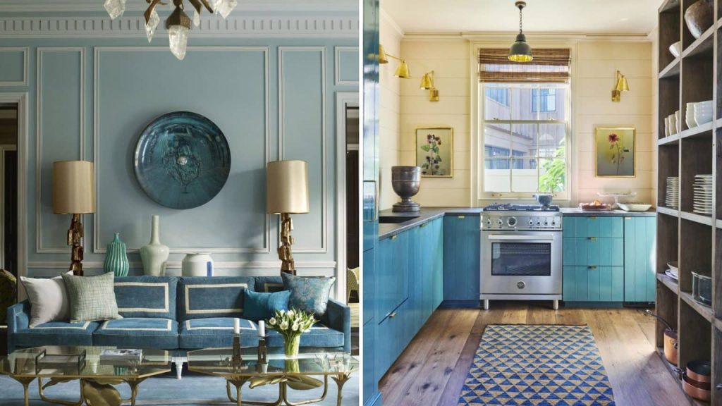
Sky Blue
When we mentioned basics earlier, we were referring a bit to this color. Blue is a base tone that we can find in any color collection, but this specific tone is intended to create calm and soothing environments, hence we think it’s perfect for the bedroom. It remains an original choice because it deviates from the typical beige or white wall, but still follows the color theory we explained above.
In addition to the bedroom, we also recommend it for spaces where activities requiring tranquility are carried out, such as studies, offices, or dining rooms. Look, for example, at the sense of calm it brings to this New York-style home designed by our studio.
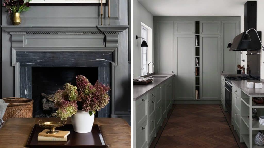
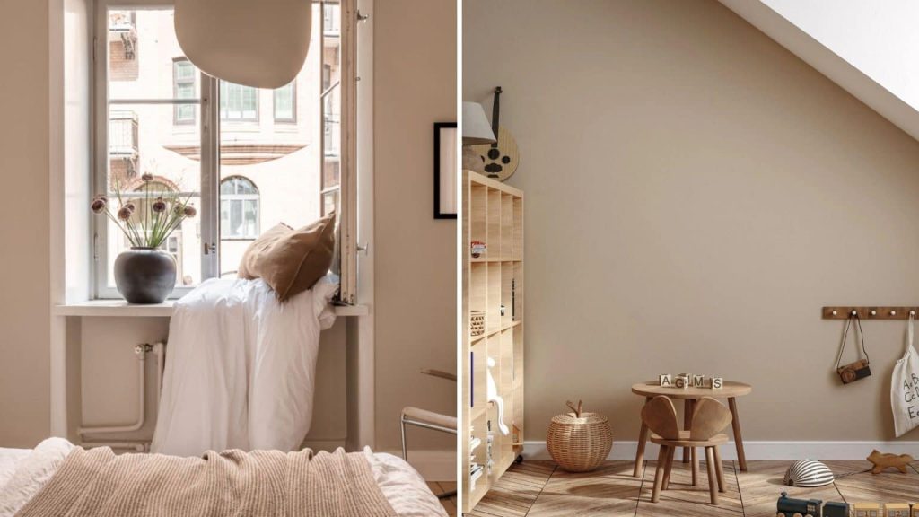
Taupe
If we say ‘taupe’, perhaps you’re not sure what color we’re referring to, but it’s a color from the range of light sand and earth tones. We’ve already mentioned that basic tones are not going to disappear, but will share space with other more powerful ones. Taupe is very elegant and versatile since it can be placed almost anywhere in the house without sacrificing elegance or modernity. Moreover, you don’t have to place it only on the walls: it can go on cabinets, blinds, textiles… It’s very easy to combine with other more vibrant colors, like the ones we’ll see next. In the REVA Housing Development project, we chose a tone similar to taupe for the walls to bring contemporaneity, simplicity, and elegance.
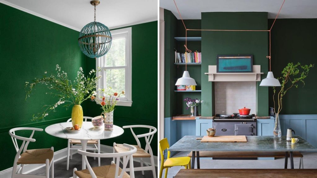
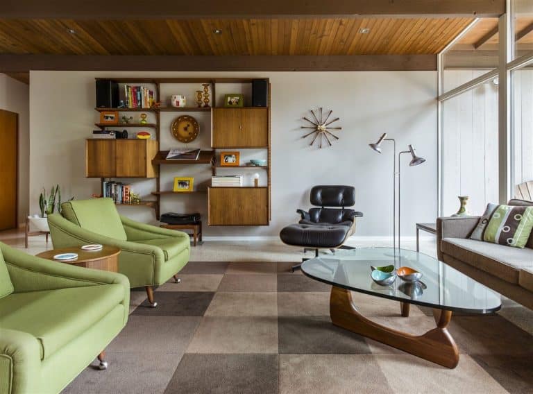
Greens
We’re talking about 2 specific tones: watercress green and jade. Both have already made their appearance at international decoration fairs, so we’ll have to pay attention to their more practical application. Green tones are always a great choice if we’re not very sure which colors to choose for our home. They provide a certain connection with the outside, with nature, which we have been yearning for lately. They also convey warmth, familiarity, and vitality, without completely eliminating calmness. We recommend playing with shades of green in rugs, especially.